Parking solutions
observed through
a Usability lense

My role: Prototyping, Research
The team: Markus Nilsson, Anna Woxlin, Fredrika Andersson, Johanna Wendt, Malin Lilja
An academical project in usability and research of parking ticket solutions
The Challenge
Quantifying a parking meter's and parking app's usability, finding weaknesses both in terms of theoretical and practical with the help of user tests. These parking solutions were redesigned and compared through quantified data between the two batches of user tests.
Our approach
As the goal was to compare two versions (original and redesign) the project consisted of two iterations with prototyping and user tests;
- Prestudy and Prototyping
- User tests - Phase 1
- Redesign and prototyping
- User tests - Phase 2
- Comparison and evaluation
Prestudy and Prototyping
How it all started
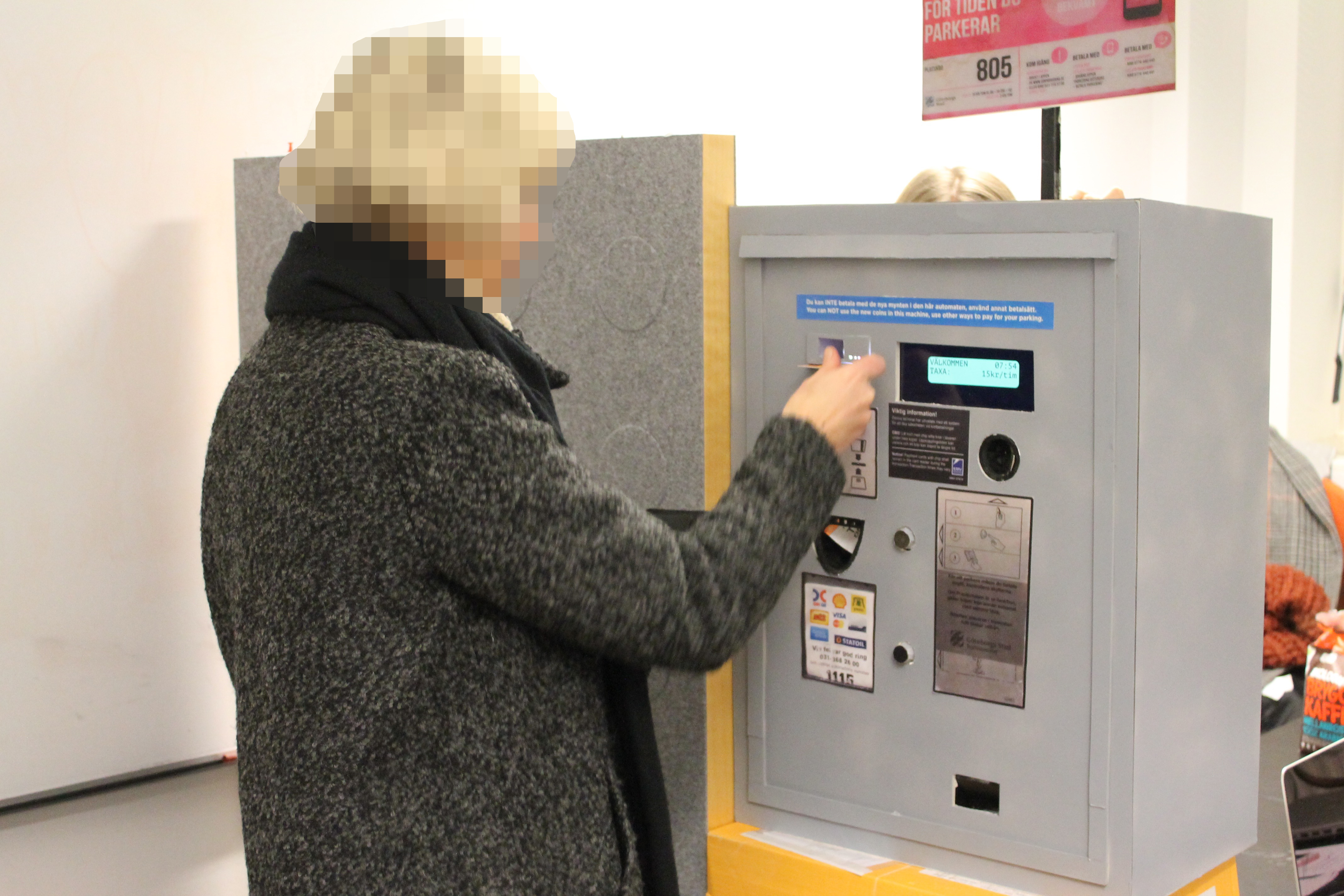
The project kicked off with a quick test of the existing parking meter and app, what were the limitations, potential problems and the benefits. In order to achieve validated results the prototypes for both tests had to have the same fidelity. The wizard-of-oz method was used to elicit feedback for the parking meter and the app used an interactive prototype made in Adobe XD.
The user tests consisted of different tasks; buy a parking ticket, cancel and retrieve a receipt of your purchase. Participants consisted of our close friends and families as we were pressed on time.
Existing problems found
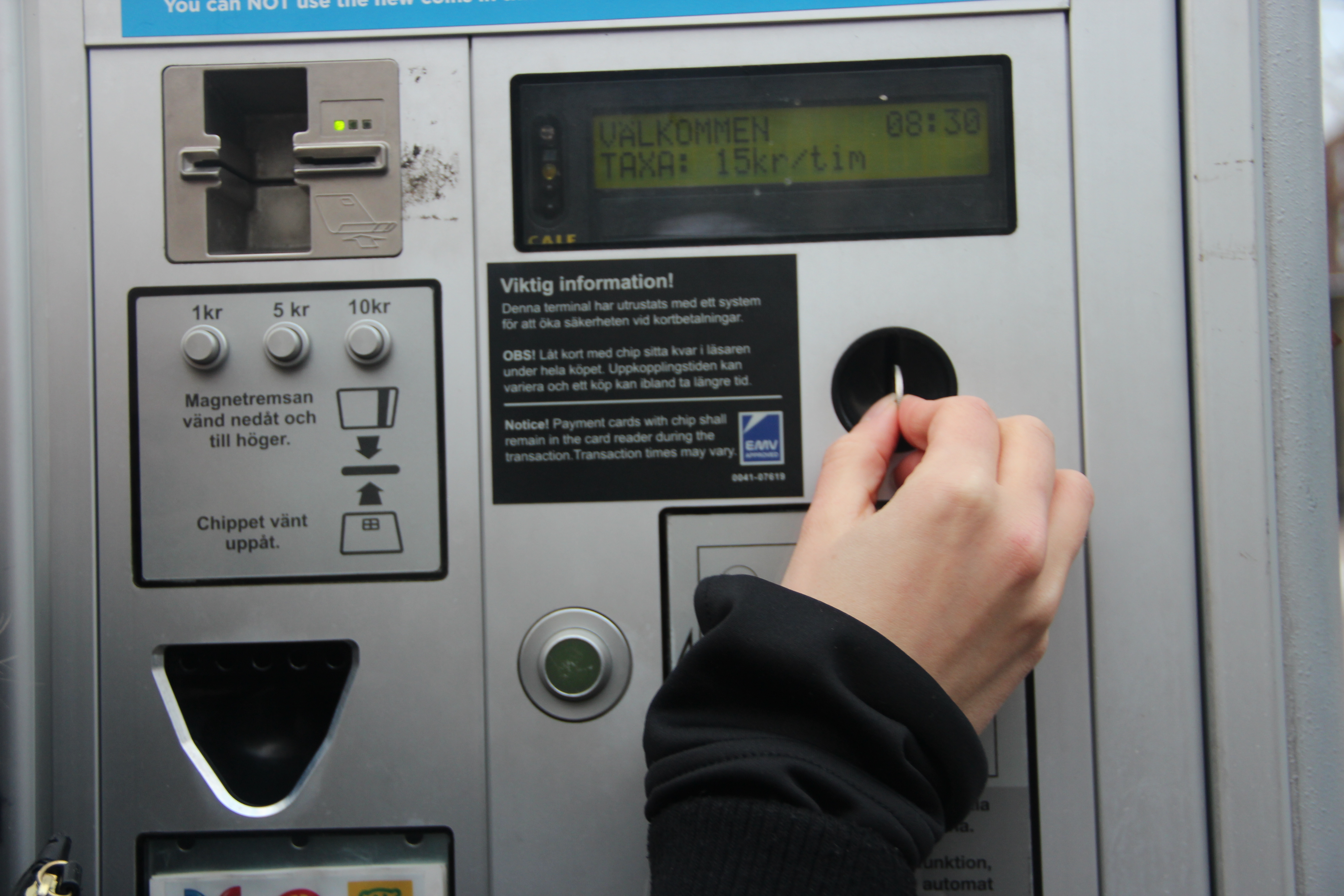
What can be so hard about using a parking meter?

Hard to understand the use of color

Hard to read instructions on the screen due to low contrast
If you thought the parking meter was hard to use, tried the app yet?

Unsure of where to start

Unsure of what have been selected

Unsure of where to find the location code
Redesign of parking meter
How small changes can make a difference
Parking meters have worked similarly for a long and people often have a mental model of how it's supposed to work. Therefore we opted for small changes such as changing the color and increasing the contrast in general to better differentiate the interactive elements. This allows for improved use but also preserves the user's mental model. The interactive elements were also grouped in their use, i.e. elements used to purchase and cancelling were separated into two groups.
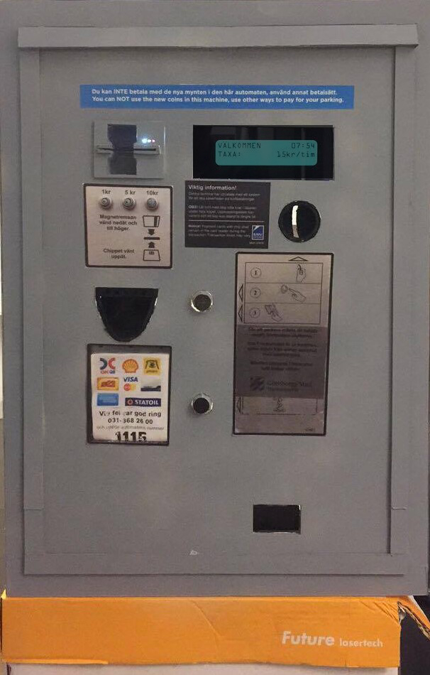
Original
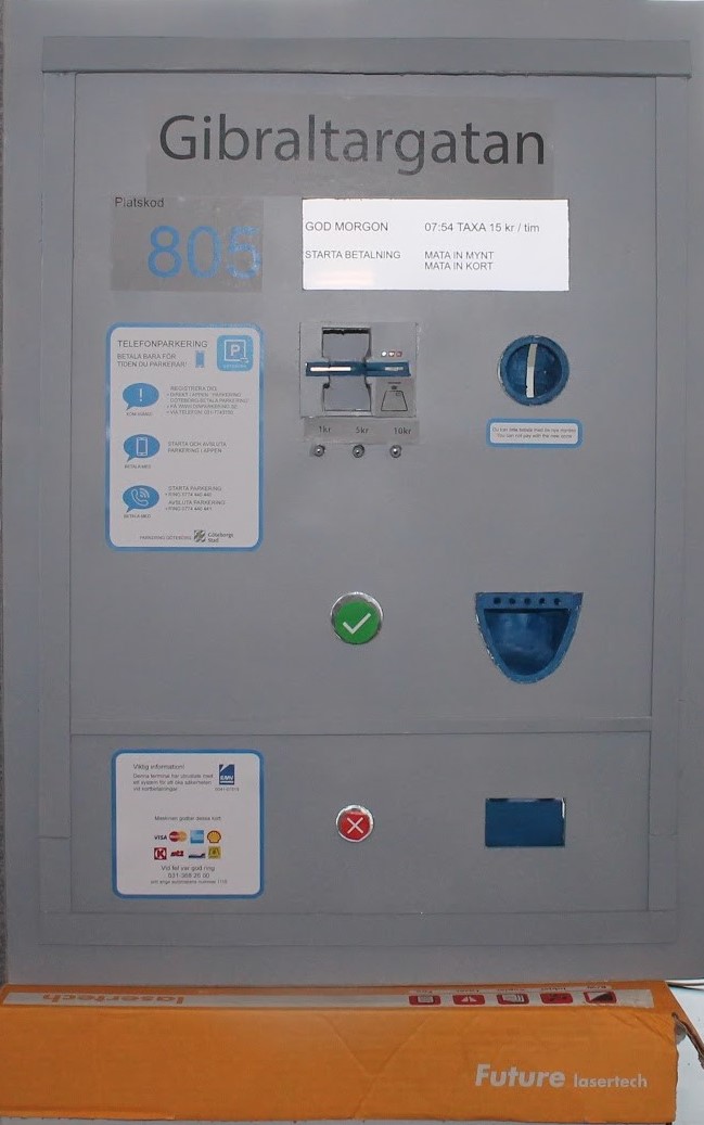
Redesign
User journey


Redesign of parking app
Restructuring a user experience
Originally, the app aimed for an efficient use by allowing the user to make every selection in the same view. However, this lead to complications for new users, therefore the redesign aimed for a step-by-step process to increase visual clarity and remove the information overload.
User journey


Original
Redesign


Comparison
Improved or not improved, that is the question?
When comparing the results, there were clear improvements in regard to the time taken, amount of errors and perceived experience. These results suggest an improvement, thus, we succeeded in our goal with the redesigns.

