LIVI aims to deliver a series of products for two-wheelers that made the journey both safer and more entertaining
The Challenge
To design a headset that fulfill the following criterias;
- Safe to use
- Gives a good User experience
- Low-cost to manufacture
My role: Design, Administration, Packaging
My team: Markus Nilsson, Carl Lindvall, Erik Folke, Casper Jonsson, Sanna Gustavsson, Oscar Johansson
Introduction
When talking about products used in traffic, especially for two-wheelers we must first and foremost consider the limitation in our cognitive resources, we cannot focus on two things very well which directly makes it dangerous to interact with an interface while driving. However, despite our awareness of the dangers several people are using their phones since they have a need to make calls or listen to music. In this project we aim to make this interaction safer by introducing a headset, keyword here is safer as interacting with an interface while driving will never be completely safe.
Our headset is intended to be launched together with a series of other products with the goal to promote a safer, more enjoyable ride. This series is called GObyLIVI and consists of three different products.

GOMINI
The brains of the system, a small control unit mounted on your handle bar. It can be connected to the headset and allows for controlling the headset as well as GPS navigation.

GOHELMET
The safety grid which like any other helmets protects your head when driving. This headset is however specially adapted to allow for an easy mounting and comfortable use with GOHEADSET.

GOHEADSET
The unit we are designing, a headset adapted for the use environment and user. To allow for a safer interaction on the road. To not give away any spoilers I will not go into any more details.
Why are not existing headsets used?
To find out about this we did a benchmarking of competitors’ solutions and evaluated it within the project group as well as with our classmates. We tested if the headset was comfortable to wear with a helmet on and if it was intuitive to use. We complemented the benchmarking with a survey sent out to various Facebook biker groups and the summary of the user study was that there were 3 primary existing problems.

Comfortability
Many of the headsets were too thick and caused a pressure on your temple with the helmet on.

Safety
Some of the headsets were hard to reach as there were no external interface or were unintuitive in its interaction.

Cost
Many of the solutions were deemed as too expensive and they would rather just use their phone instead.
Rapid Iterations
The focus quickly narrowed to the headset’s shape as it decides whether it is comfortable or not and it also determines if it is costly to manufacture. A second goal was to see if it could be designed so that one could interact with the headset purely through the haptic sense as that would allow the user to focus on the road and make the interaction safer. We 3d-printed them to test our ideas which allowed us to make quick user tests and get rapid feedback to make several smaller iterations.
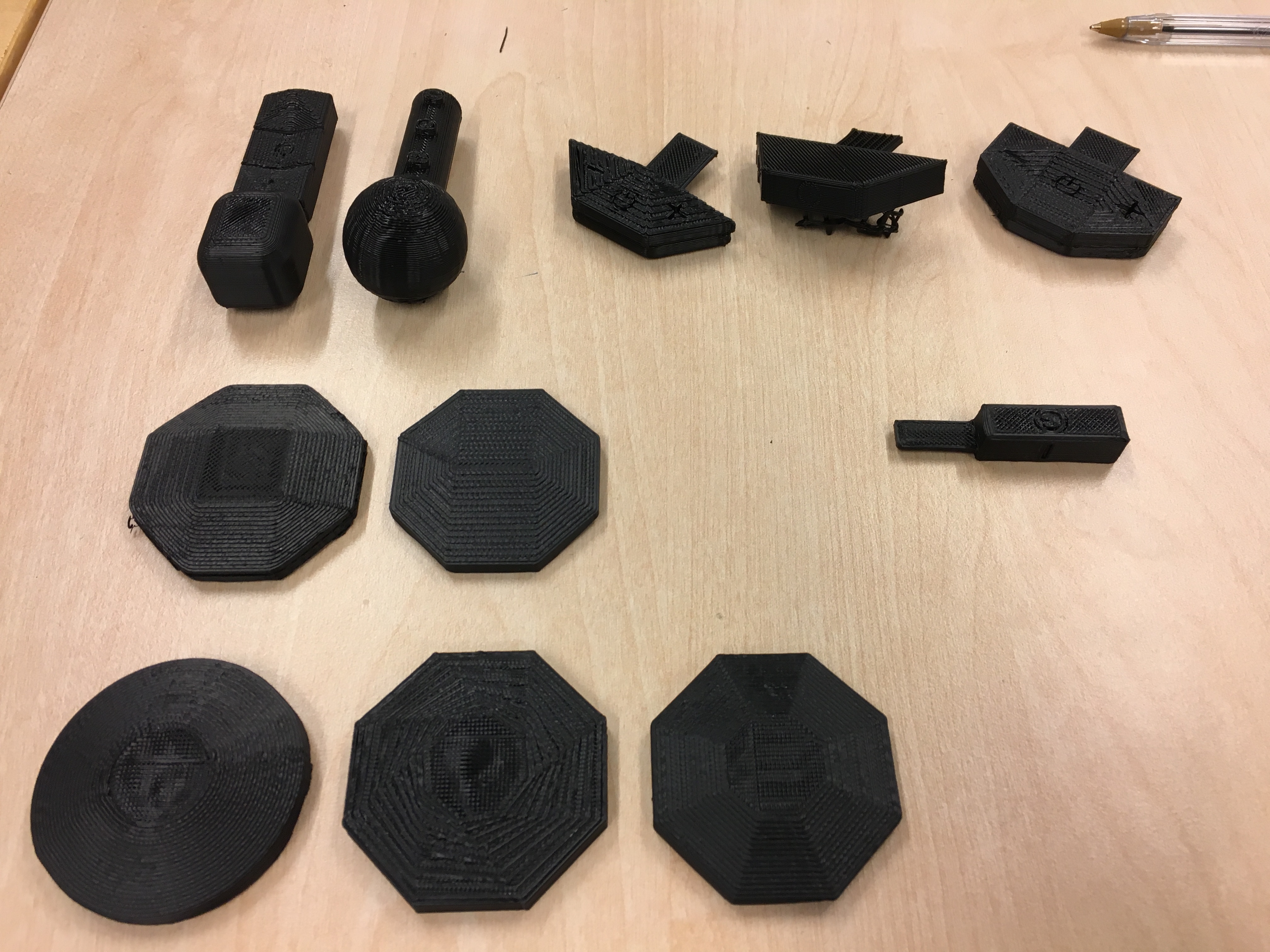
After several iterations it was decided together with LIVI to continue with one concept and refine it further as well as consider manufacturing aspects such as materials, shaping process and assembly. As you may have already guessed, the final concept is called…
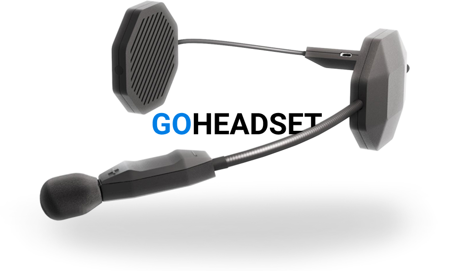
Our solution, the GOHEADSET addressed the problem we found in user studies in one way or another. All parts of the concept is working in tandem to realise the goals we set; safe to use (i.e. intuitive and efficient), comfortable and cheap.
Safe to use
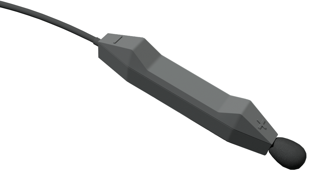
The key factor to making the interaction safer is the haptic cues the microphones gives to the user, from our user tests we found that they had no problems finding the buttons and distinguishing them from each other, even with gloves on. This is the result from having moderately large buttons as well giving them a clear direction; inclining, declining or flat. With this 3 button interface they can perform all actions needed by varying the duration of a click or the amount of clicks. The functions are mapped similar to existing regular headsets, thus, allowing users to use their existing cognitive models and prior experience. For example, raising volume is done by holding down or pressing the [ + ] and if you were to double-click [ + ] you would instead skip to the next song.
Comfortable
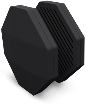
Both the earphones and the battery pack is placed between the padding with the help of Velcro pads, one Velcro pad is permanently fastened to the interior and the other one on the earphone. Each Velcro Pad can be fastened together but also easily removed if needed. Contrary to existing solutions, GOHEADSET have separated the battery from the earphones into a battery pack which is placed in the back of the helmet, this decreases the earphones’ thickness and together with the soft cushioning of the paddings the headset is now comfortable to wear.
Low-cost
This is perhaps one of the trickier aspects for us as students as we are not in contact with neither the manufacturer nor supplier. Instead we focused on the manufacturing process, the design is optimized to be easy to manufacture, the thickness and shape are adapted to plastic manufacturing processes and the assembly is done via either hinge fastenings or adhesives depending on the need for water proofing. We ran this by a professor at our university specializing in plastic manufacturing processes to be absolutely sure if it is a viable design which he said it was.

Improving the first impression
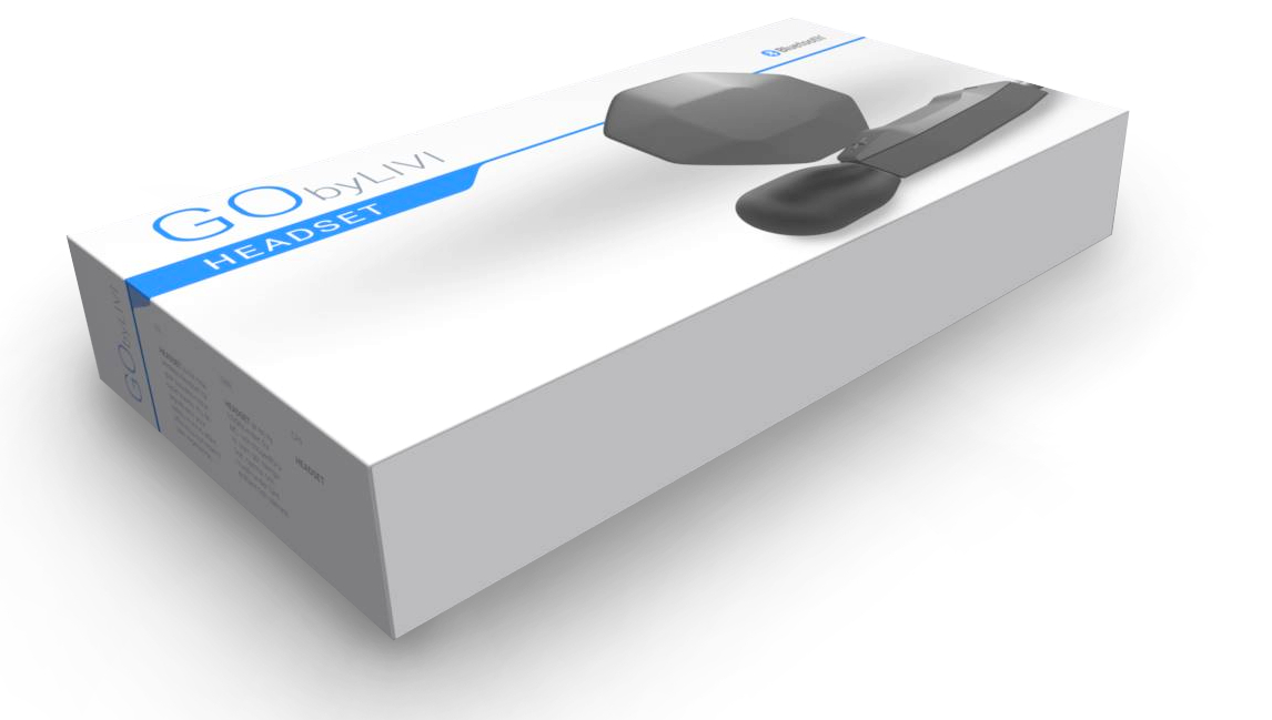
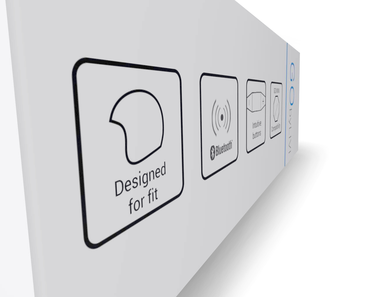
First impressions are important, LIVI wanted us to design the package and instruction manual to complete the experience of GOHEADSET. LIVI wanted the product to feel luxurious rather than a cheap copy despite the low cost. Thus, we aimed for having a slick design where the lid is tightly fitted to the box. When first opening you are faced with only the headset, all cables and manuals are placed under the plastic mold to give a clean first impression. Colors used are matching the LIVI brand, blue (#007ee5) and white to increase brand awareness.
