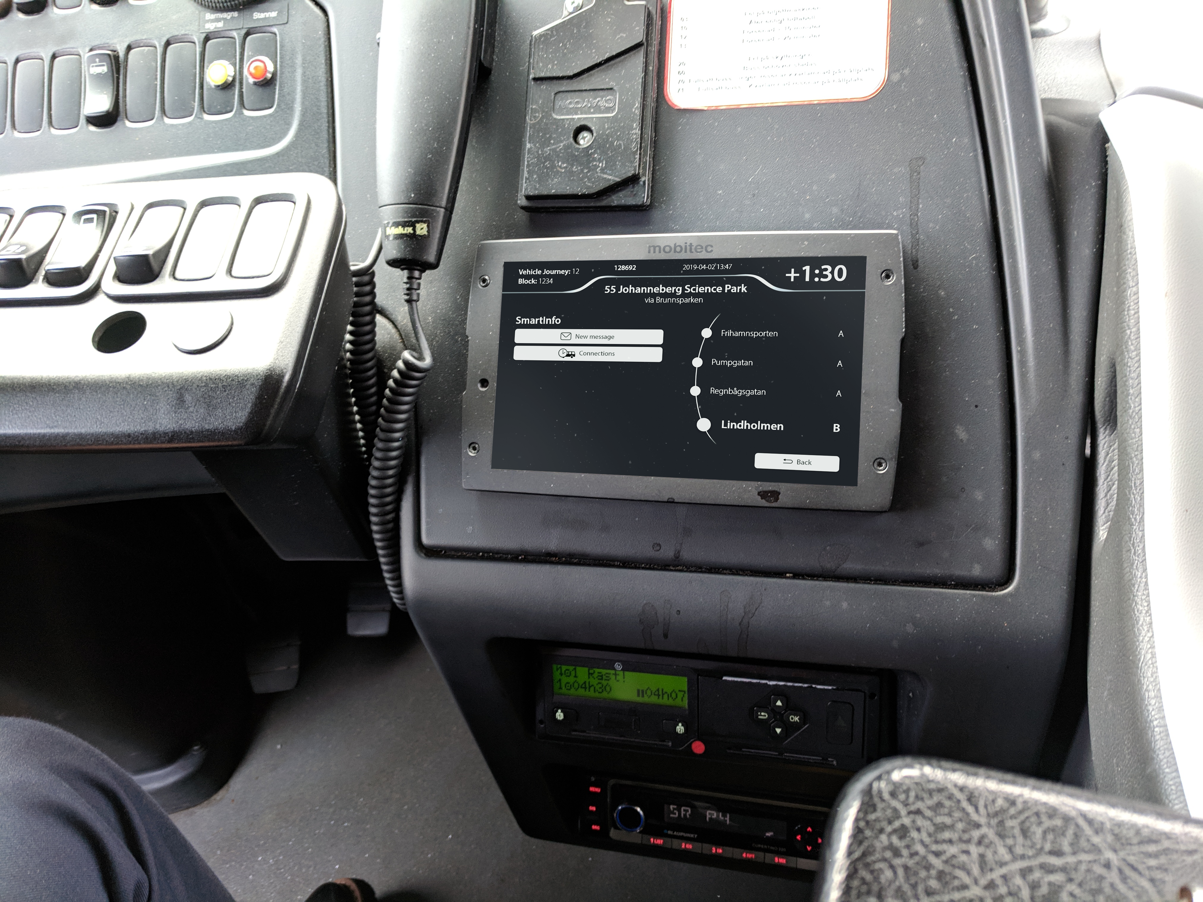
Designing bus drivers' trusted assitant
2019
My role: UX/UI
The team: Markus Nilsson, Rebecka Jönsson
Mobitec is a company delivering information technology to public transport. 2019 They decided to develop a supportive tool for bus drivers.
The Challenge
Bus drivers are exposed to a stressful environment where they have no time left to their side-tasks. As a diverse user group not everyone is comfortable with technology and some find it more hampering than supportive.
Our approach
We approached this project with the typical user centered design process with multiple iterations of;
- Prestudy / Investigating the user and the context
- Ideation
- Prototyping
- Evaluation with user tests
Prestudy

With the goal to create an interface which facilitates their work tasks, the project was initiated with study visits combined with interviews and observations on several bus depots in different regions. It started with a broad approach and was narrowed down later on to keep it focused on the discovered problems.
Existing problems

No time available to do side-tasks
A bus driver operates on a tight time schedule where there aren't many opportunities to catch up on time lost due to unforeseen circumstances. As such, bus drivers often skips doing extra tasks such updating signs and sending information to traffic management.

Language barrier
In Sweden, bus drivers are a diverse group with over 46% of the drivers born outside of Sweden. Not every driver is fluent in Swedish or used to technology, meaning that it is essential that the interface is self-explanatory and intuitive.

Poor adaptation when traffic disturbances occur
It's not rare that a traffic disturbance occurs, especially in urban environments. This creates problems for existing systems and they cannot cope with a new route, send and receive information of relevance.

Poor compatibility
The existing systems have low compatibility, meaning that tasks are not executed similarly to how they normally are done. This also applies for the use of symbols.

Ideation
The ideation consisted of brainstorms and discussions on whether it would help solve one of the problems found. The concepts that passed the first round were later scrutinized on whether they were realistic and profitable.
Evaluation
With the help of bus drivers we conducted user tests with an interactive prototype of the interface. The bus drivers got to experience different scenarios with assignments. The scenarios in the user tests were;
- A default journey
- A journey where the bus got full of passengers
- A journey where there was a traffic disturbance which demanded they take a different route
- A journey where they had to coordinate with another driver
User Journey
The right information at the right time
MobiLity have two statuses which depends on whether the bus is in motion or not. When driving you should obviously not interact with the interface and it therefore only shows a GPS-navigation for your route which updates if there is a traffic disturbance.
At the bus stop
When standing still the interface shows the line guide and the SmartInfo. This gives the driver a clear overview of the most essential information needed at the bus stop, mainly;
- The correlation to the timetable
- The stops along the route
- Notifications (or) messages

SmartInfo
The SmartInfo can be described as the brains of the interface, this is where interface becomes proactive. There are a lot of unused data which could be used to indicate certain scenarios, the most prominent being a full bus.
When the bus is full the driver should manually change the exterior signs to full bus, this takes about a minute, a minute they don't have to spare. But with the SmartInfo using the data calculating how many people goes on and off a bus it can serve as an indicator for when the bus is almost full of passengers. Instead of letting the user go through several menus and selections the SmartInfo does the work for you and suggests said action. Now the driver only needs to confirm or reject the suggestion. This means that what previously took a minute now only takes a second and a single click.

What did the drivers think about the interface?
The drivers were ecstatic about the interface, it tackled the problems which they had described when interviewed. It also greatly alleviates the information overload and is easy to use which also helps the drivers who are not as experienced with technology, meaning it's a great fit for many drivers.
